Tuesday, December 20, 2016

Pix4D

Introduction

Over the course of the semester, the class has learned many useful techniques and strategies to help survey data in the field. Much of these techniques were learned using either specific survey equipment or more traditional methods. In this final assignment, the goal was to show how the use of UAS and software for UAS can be used to complete most of the tasks that we completed over the semester in a much shorter time. In this assignment, Pix4D was the software used to explore a UAS mission flown by Dr. Hupy over the Litchfield Mine. 

Methods

All of the data that was used in this project was provided to us by Dr. Hupy. The first step in this project was to create a new folder and paste the necessary data in it. Next, Pix4D was opened and a new project was created. Inside the new project, control points were placed to create a processing area for when an image was going to be processed from the mission. The project that was run, creates an orthomosaic and a digital surface model of the specified processing area. Once the project starts to run, it is a waiting game. The software has to process all of the images taken by the UAS during its mission and then mesh them all together to complete a full image. Once this is done, there are many different tools that you can run with the finished product. For example, you will see in the results, a calculation for the volume of one of the sand piles in the mine, the distance of a line, and the area of a specific zone on the mine. These are just some of the ways that Pix4D can be used along with a UAS to survey land. 

Results

To start off, Figure 1 shows the mission that was run by the UAS. Each red dot signifies an image being captured. Starting from the top right and snaking to the bottom left. The red box with a grey fill represents the processing area that was chosen. 

Figure 1. Shows the mission that was run and the processing area that was chosen.
Next is the results of the orthomosaic and the digital surface model. You can see that both the images are in the shape of the previously defined processing area. Figure 2 shows the orthomosaic on the left and the digital surface model on the right. 
Figure 2. Orthomosaic and digital surface model from the project.
Next, when going over the results of the process, Pix4D gives a report to notify you on how the process went. One of the helpful tools provided is Figure 3. It shows how much overlap in images there was in the processing area. The more overlap of images, the more accurate that area will be. It is ideal, in this case, to have as much green as possible. 
Figure 3. Shows the overlap report from the image processing. 

As stated earlier, there are tools that can be run once the processing has been finished. One  of the tools that was run was the length tool. Figure 4 shows the length tool run. The upper right side of the screen shot is where the results are shown. The line segment that is measured is located towards the bottom left of the image.
Figure 4. shows the length tool being used. 
Figure 5 shows another tool that was used in this project. That tool is the area tool. This tool allows you to create a polygon and measure the area within that space. The green area shown in Figure 5 represents the area that was measured. The results are posted in the top right of the image similar to the previous figure.
Figure 5. shows the area tool being used. 
Figure 6 shows the last tool that was used in this project. The volume tool. This tool, as you can imagine, can measure the volume of an object in the digital surface model. To show how this works, one of the sand piles was used. In Figure 6 you can see the mound is highlighted, and the results are posted in the top left of the image. 
Figure 6. shows the sand mound that had its volume measured. 

Conclusion

Over the course of the semester we learned many ways to survey data out in the field. From the total station survey to the ArcCollector survey, I feel that I learned a lot about the different ways of going out to collect data. This UAS and Pix4D assignment was the perfect assignment to end on for this course. It was an excellent way of bringing everything together to show the class that UAS can be one of the most useful and versatile pieces of surveying equipment that we can access. The power that they have to create mosaic images and digital surface models has changed the game. I wish that we would have been able to work with the UAS more through out this class so that we could get an even better feel for its potential. 


Tuesday, December 6, 2016

Topographic Survey

Introduction

This weeks assignment focused on using a survey grade GPS to take elevation data from specific areas on campus. The data was taken from a small patch of grass located in the Campus Mall. The study area was surveyed because the land was rather uneven and it would give the class a chance to utilize the high powered GPS to create digital elevation models. 

Methods

This assignment required the class to make a trip outside to collect some data. The overall study area was small. A small patch of grass located in the campus mall was used as the study area. The class used a high precision, survey grade GPS. The GPS unit was used by every individual in the class. This means that there were roughly 20 points taken to create a DEM. The survey method used was a random sample. This means that the GPS unit was moved to random areas throughout the study area to make sure that all of the points were not being taken from the top of the hill area or at the bottom of the hill. The GPS unit collected both Latitude and Longitude as well as an elevation value.

Once each student got a chance to use the GPS to survey a point, the data was transferred from the GPS to a text file. The data was then imported into an excel spreadsheet from the text file. Once there was a working spreadsheet, it was time to create a file geodatabase. With the file geodatabase, the excel spreadsheet data could be imported and used to create the DEM. This was done by importing the spreadsheet and creating a point feature class. Using the point feature class, different tools could be run to create different DEMs. An IDW, Kriging, Natural Neighbor, Spline, and TIN were all created from the points. All of these DEMs were created in WGS 1984 UTM zone 15 projection so that there is minimal distortion. With these rasters, maps were created to show the elevation changes in the study area. To finish off, these rasters were placed into ArcScene to create 3D images of the rasters to better show the elevation changes. 


Results

The results of this project include all of the different raster DEMs created as well as the different 3D images created. It is interesting to look at how the different interpolation methods change how the data is interpreted. Figure 1 shows the final rasters created in ArcMap.

Figure 1. This is the compilation of all of the rasters that were created in this assignment using different interpolation methods.


Figure 2 through 6 show how all of the different interpolation methods are different through the 3D image creation of ArcScene. 


Figure 2 shows the Kriging interpolation method displayed in ArcScene.

Figure 3 shows the Nearest Neighbor interpolation method displayed in ArcScene.

Figure 4 shows the Spline interpolation method displayed in ArcScene.

Figure 5 shows the TIN displayed in ArcScene. 
Figure 6 shows the IDW interpolation method displayed in ArcScene. 
From looking at these different interpolation methods, you can see which methods worked well for this project. Seeing as there was one larger hill on the Southern side of the raster, the method that truly best displays it is the Nearest Neighbor method. The TIN and Kriging also represent this fairly well. The issues that arise with the IDW and the spline are that you can see specific holes and mounds that do not actually exist in the area.


Conclusion

This project gave the class the opportunity to work with a high precision, survey grade GPS in order to create multiple DEMs to represent a small area on campus. This was a nice project to get to work with the survey grade GPS because we were surveying such a small area that it was very easy to visualize what the DEMs should come out looking like. It was interesting to see how different interpolation methods can change the output by so much. For example, the IDW ended up looking like a completely different area. Overall, this was a very good assignment to teach us how the survey grad GPS works and how to use it as well as refine our skills in creating DEMs using different interpolation methods and being able to interpret them. 


Tuesday, November 29, 2016

Hadleyville Cemetery ArcCollector

Introduction

The Hadleyville cemetery project that was completed earlier in the semester was a large group project where the class had to go out and collect data on graves and put together a final map showing grave locations and containing a database for the graves. There was a high potential for error when the data was compiled into one big database because each team collected data from different sections of the grave. The purpose of this assignment was to go back to the cemetery and utilizing ArcCollector, test some of the graves to see if there were any errors in the original data.

Study Area

The data was collected from the western half of the cemetery. The cemetery is located in Eleva, Wisconsin. Eleva is approximately 15 minutes south of the Eau Claire campus. Figure 1 is a map of the study area for this project. 
Figure 1. Map of the study area for this project.

Methods

This project was heavily reliant on the geodatabase that was created before the data collection process. The database had to be created with domains so that the data entry process in ArcCollector would go as smoothly as possible. The first step was to create the geodatabase. The next step was to create the domains in the geodatabase. The domains that  were created were Date of Birth, Date of Death, and status. These domains would be helpful when entering certain pieces of data. The next step was to create the actual feature class and add all of the necessary attributes that would be recorded. The attributes in the feature class were grave ID, first name, last name, DOB, DOD, status, and joint tombstone. These were the attributes chosen in the previous project so it made sense to use them again. Once the feature class was created, it was time to go to the cemetery and collect the data. This portion of the methods is rather self-explanatory. Each grave was surveyed to the best ability. Some of the graves were difficult to read but collecting as much data from each grave is important. Once the data collection process was finished, it was time to compare the data. 

Results

After going back and looking at the two databases, the data is, for the most part, the same. The biggest issues withing the two databases is that some of the graves are shown in different locations. This changed up some of the grave IDs. Other than that there were only a few errors. Figure 2 shows the final map for the original Hadleyville project. 
Figure 2. The original Hadleyville project map.
The online map that was created with ArcCollector can be found at this link: ArcCollector Map
As you are able to see, between the two different maps, some of the placement is off. This is because when using ArcCollector, the GPS isn't as accurate as we might like. This is especially true in this case. Because the cemetery is in a rather remote location, the cell service isn't very good. This had a negative effect on the results. Figure 3 shows the original data table where you can see some of the similarities and issues.
Figure 3. Part of the original dataset.

Conclusion

This project allowed me to go back and revisit a previous project to see if it was done accurately. This was a good learning experience because I got to see what it was like to basically do the same data collection in two different ways. This allowed me to see the pros and cons of the two data collection processes that were used. If I were to do this again, I would have brought the original data that was collected along when doing the ArcCollector process. This would have helped to see right away if there were issues in the original data. To conclude, it would seem that, for the most part, the original Hadleyville project was done accurately. 

Tuesday, November 15, 2016

Microclimate Data Collection

Introduction

The purpose of this activity was to utilize Arc Collector to collect micro-climate data from many different locations on the UWEC campus. Everyone was divided up into two person teams and sent to specific zones within the study area. The class as a whole was supposed to walk around and collect climate data for specific points. The data that was collected included the temperature, dew point, wind speed, and wind direction. This data was all able to be collected by the use of a tool that could digitally measure all the required data. 

Study Area

The study area for this project was the main Eau Claire campus. This excluded Mcphee Center and any buildings South of that. The Study area was divided up into zones so that each team was able to collect data in a smaller region. My group was assigned zone 2. Zone 2 included areas around Schofield Hall, Schneider Hall, Centennial Hall, Hibbard Hall, and the Zorn Arena. Figure 1 is a map of the entire study area and the different zones within the study area. Figure 2 shows zone 2 within the study area.

Figure 1 is the entire study area and the zones
it is divided into.

Figure 2 highlights zone 2.

Methods

The methods in this assignment were relatively straight forward. Each group was deployed to their zone and were told to collect somewhere around 20 points. In zone two, the best strategy that was developed for the collection method was to start on the left side of the zone, and move north towards Hibbard Hall. Once at the top of the zone, we zig-zagged back South to try to cover the middle and Eastern portions of the zone. At each point, the temperature was recorded along with the dew point, wind speed and wind direction. 

Some of the points that were taken were in areas that may have been blocked by the wind. There were some points taken in the shade to see if there was a temperature change. All of the data collection was done on each persons smart phone through the Arc Collector app. Because the map itself was shared between the class via ArcGIS online, the map would constantly be updating with other groups collected data points. 


Results

The results for the micro-climate data collection were all compiled in the ArcGIS online map that the class shared. Because the points and data were so easily combined, the only thing that needed to be done was bring the data into ArcMap and create maps showing the results. Maps showing the results of the temperature, wind speed and wind direction were all created. 

Figure 3 shows the temperature data for each point collected. This was an interesting assortment of data. The values range from a max temperature of 66 degrees to a minimum temperature of 48.6 degrees. Some of the factors that could have changed the temperature so much would be direct sunlight versus shade. Another factor that was found was heating vents in the sides of buildings.
Figure 3 shows different temperature data collected.

Figure 4 shows the difference in wind speed. This category was a little more difficult to measure because gusts of wind could effect the maximum reading. Our group tried to find the average reading over roughly 20 seconds. Throughout the groups, the maximum wind speed collected was 10 mph. The minimum wind speed was zero. places where no wind would be found would be directly behind buildings. The two windiest spots collected were both located under the Hilltop bridge. This bridge would create a sort of wind tunnel effect. My group's highest wind speed was collected right off the edge of the Chippewa River on top of the bridge.
Figure 4 shows the wind speed data collected. 

The last map that was created is shown in Figure 5. This map shows the direction of the wind collected at each point. I believe that this map is not as accurate as it should be. This is because all of the groups didn't go over the same method of collecting the wind direction. My group collected the angle in which the wind was coming from.
Figure 5 shows the direction of wind at each point.

Each point has all of these pieces of data stored inside of it. To show this, figure 6 shows what happens when you use the identify tool and click on a point. Figure 7 then shows a sample of what the attribute table looks like for the point feature class.
Figure 6 is the data that is stored in each point. 


Figure 7 shows a sample of the attribute table for the point class.

Discussion

It was interesting to use Arc Collector for this assignment. It seems like it is an effective way to collect simple data and easily record it into ArcGIS online. The major issues that my group ran into were issues involving cell service and phone battery. Today many phone GPS are very accurate, but a lot of the time the accuracy can be effected heavily if the cell service is lacking. Both my partner and I didn't have an accurate GPS position until we were outside. Regarding phone battery, my phone died just before we finished. This could have been a lot worse if we weren't in groups. Overall, for a relatively simple survey, it seems like Arc Collector works very well.  

Conclusion

Overall, this assignment helped to familiarize the class with Arc Collector and a new way to go out and collect data. Using ArcGIS online was also a relatively new experience for me. It was nice to experience such an easy transfer of collected data into a GIS. This assignment proved that Arc Collector is an easy way to create a geodatabase of surveyed data. 


Tuesday, November 8, 2016

Priory Navigation

Introduction

In this weeks activity, the navigation maps that were create were put to use in the Eau Claire Priory. The Eau Claire Priory is a large, mostly wooded region with many hills and cliffs that make it difficult to traverse. Each group was given five different UTM coordinates and one of the maps that were created in the last activity. To find each one of these points, the groups needed to use classic navigation techniques to find each point. 


Methods

Study Area

The study area for this activity is the priory of the University of Wisconsin Eau Claire. This is a large wooded area that would be difficult to traverse with simply an aerial photograph. Figure 1 shows an aerial image of the priory. 
Figure 1. The study area of the Eau Claire Priory is shown by the black rectangle.

Tools Used

In order to navigate through the priory, different tools were used. The most important tool that we used was a compass. The compass allowed us to find the necessary bearing to make it to the next point. Another important tool that was used was a GPS. The only thing that the GPS was used for was to create a track of where each group had walked. 


Navigation

The actual navigation process was somewhat difficult. As stated before, each group was given a set of five different navigation points in the form of UTM coordinates. The points that my group had to find were:

618011, 4957883
618093, 4957823
618107, 4957942
618195, 4957878
618220, 4957840

Using the UTM navigation map, each point was placed on the map. The next step was to go out and find the points. In each group, it was important that each person play a different role to help navigate. Some of the roles included a pace counter, azimuth control, and leap frogger. The pace counter would walk between points, counting their paces to establish distance. The azimuth control would stand at a point and ensure that the pace counter was heading in the correct direction. The leap frogger would run to a landmark in the general direction of the desired bearing. At each point, the bearing had to be taken so that the group was headed in the right direction. The bearing was found using the compass. It required the use of the "red in the shed" technique. Each point was represented by a pink marker that was either wrapped around the tree or hanging on a branch. Figure 2 shows the first point that was found. 


Figure 2 shows the marker for the first point. The marker was wrapped around a large
tree and was somewhat hidden in the brush.

The next point was one of the few issues that the group ran into. The correct location, according to the UTM coordinates, was found, but the marker was not found. The groups were told that this could potentially happen. In that case, the marker was to be placed. Figure 3 shows an eager navigator marking the second point. 


Figure 3. There was no marker for point 2, so the group had to make sure that it was marked.

The next two points were rather straight forward. All the group had to do was get a bearing. For both the third and fourth points, the leap frogger was able to walk out and see the marker. This was possible because these markers were located in more open areas compared to the first and second points. Figure 4 and 5 show the third and fourth points that were navigated to. 

Figure 4. Another eager navigator found the third marked point. 


Figure 5. The fourth navigation point was found by the group without any issue.

The fifth and last point in the navigation exercise was located in another difficult to reach location. The group was required to climb down a steep cliff into a large valley and then up the other wall to reach the marker. The fifth and final point was located towards the end of the wooded area in the priory. Figure 6 shows a picture of the final marker. 


Figure 6. The fifth and final marker in the navigation.

Results

The results section will be very brief in this assignment because the vast majority of it was the navigation methods. The one thing that needs to be shown is the final track from the group's GPS. Overall, the track looks accurate. Figure 7 shows the navigation map with the GPS track that the group recorded. 
Figure 7. The final navigation map with the GPS track recorded on top. The track is represented
by the maroon dots.

Conclusion

This activity was extremely enjoyable and educational. Learning to navigate without the use of some of the high tech geospatial equipment is very important. There were many things that I learned throughout this experience. Personally, I am an outdoors person, so getting out and navigating through the woods was a blast. All of the things that we saw on this trip, from the wildlife to the miscellaneous items in the woods, brought together an important learning experience.  


Tuesday, November 1, 2016

Creation of Priory Navigation Maps

Introduction

For this project, the class will be going to the priory in Eau Claire to use navigation maps to find different locations within the grounds. The first step for this project was to create the maps. This post will go over the methods involved in creating the navigation maps. The next post will talk about the process of navigating the priory with our navigation maps.

Methods

Data

To start off, the data that was provided came from the USGS. There was an aerial image of the area, a contour map, a digital elevation model, the study area and an example of a navigation map that showed some contours and some of the physical features in the area. These pieces of data were used together to create an effective navigation map.

Coordinate Systems

For this assignment, two different maps needed to be created.  One of the maps used the WGS 84 coordinate system. The other map used the NAD UTM Zone 15. There are different reasons that these two coordinate systems. WGS is a coordinate system that is standard through out the entire world. The coordinate system is relatively accurate and doesn't have much distortion. Usually it will be used to map at a smaller scale. Universal Transverse Mertacor (UTM) is a system that is divided up into 60 zones that stretch 6 degrees from east to west and from pole to pole. These Zones stay a little more true to the shape of the Earth's surface at a larger scale. UTM is good for mapping more specific areas because more distortion occurs around the edges of the zones. This means that any areas that are spanning across more than one zone will have more distortion. So to quickly summarize the two systems, WGS is relatively standard throughout the world meaning you will get the same amount of distortion just about everywhere. UTM is split up into zones and is more accurate for smaller things that are inside these zones, but becomes less accurate when larger areas are being mapped.

Creating the Maps

First, each map was assigned the correct coordinate system. The next step in the creation process was to bring the study area into the map. This is represented by a black box on the map. The next step was putting in the aerial image of the priory and making sure that it was set to the correct coordinate system. Once the imagery was brought in, the next step was using the tool to convert a DEM into a contour feature class. The contour feature class that was created has a 5 foot contour interval. The contour feature class was put on top of the aerial imagery so that the map will give a sense of the elevation of the landscape as well as showing physical features of the landscape. Once both of these were together on the map, a grid was created. The grid will give measurements and help to show how far different things on the map are from each other. The WGS map grid uses decimal degrees as units and the UTM map uses meters as units. Once the grids were in place on each map, the final map elements were added. This includes a title, author name, legend, north arrow, and scale. 

Results

The results from the first part of this assignment are the two navigation maps that were created. Figure 1 is the map that uses the WGS 84 coordinate system. Figure 2 is the map that utilizes the UTM Zone 15 coordinate system. Both will be used in our next activity when navigating the priory.


Figure 1 is a map in decimal degrees and uses the WGS 84 coordinate system.

Figure 2 is a map in meters and uses the UTM Zone 15 coordinate system.


Conclusion

This activity helped to, first off, get a good visual of the area that we will be navigating. The mapping of the area itself was a relatively straight forward activity but it was enjoyable. I am looking forward to our next activity where we will get to put our maps to use and see the differences in navigation maps using WGS and UTM coordinate systems. 

Tuesday, October 25, 2016

Distance Azimuth Assignment

Introduction

GPS technology has improved a significant amount throughout the years. At this point, it would not be ideal to leave your GPS technology at home when conducting a survey. However, there are situations where GPS technology and equipment will not be available and a knowledge of manual survey techniques is very important to have. Surveying with a grid based coordinate system will but in many cases, it will not be the ideal survey method. In this lab, a basic survey technique with distance and azimuth was used to map out the locations of trees in Putnam park at the UW-Eau Claire campus. 

Study Area

The study area of this project was Putnam park in the UW-Eau Claire campus. The surveying took place on Putnam Trail located behind the Davies Student center. This was an ideal location to survey different tree locations because of its interesting geographical location. One side of the trail is located in a flood plain that turns into a swampy land in the spring. The other side of the trail is part of the famous hill on the Eau Claire campus. Figure 1 is a map of the study area and where the surveying took place on the campus. 
Figure 1. This is a map that shows the study area of a
survey of tree locations in Putnam park. The study area
is shown by the green box. 


Methods

The class divided into three different groups. Each group had their own origin location where the distance and azimuth was calculated from. Varying forms of technology were given to each group. Some of the equipment that was used was a basic GPS unit to find our origin point, a tape measure to measure out the diameter of the trees that were mapped, a tape measure or a rangefinder to map the distance each tree was from the origin point, and a compass that could calculate the azimuth by looking through it. All of the data was recorded into a notebook to ensure that it could be kept and entered into a spreadsheet later. 

The methods to collecting the data were relatively straight forward. One or two team members would be standing at the origin point in order to collect the initial latitude and longitude of the point. Those team members would also measure the distance each tree was from the origin point as well as collect the azimuth angle. One or two other team members would be located at the tree that was being surveyed. These team members would identify the tree species as well as measure the DBH (diameter at breast height) of the surveyed tree. The remaining team members would be standing by to record the surveyed data. Team members rotated duties so that everybody was able to get experience with each responsibility. Once the required ten trees were surveyed, the group shared the collected data so that everyone had their own hard copy. 

Once all of the groups had completed the survey, all of the data was collaborated into a single spreadsheet. The collaborated data was imported into ArcMap so that the survey could be represented with a map. The Bearing Distance to Line tool in ArcMap used the table that was created to map out the azimuth and distance in a vector format. A line stemmed out from the origin and pointed to each surveyed tree. The next step was to use the Feature Vertices to Points tool to show the origin point along with each of the surveyed trees. 

Results

The original results of this survey were not ideal. Figure 2 shows the original mapping of our points. As you are able to see, the points are not all located inside of the study area. One set of surveyed trees shows up miles south of the study area. It is hard to tell at this point if the reason for error is human error or technological error. There is potential for error in both. It is very easy to incorrectly record the collected data into the spreadsheet. It is also very possible that the GPS was giving an inaccurate location. Regardless There were two sources of error in our original data. One of the sources I am very confident that it was human error and one of our origin points had two numbers mixed up in the X value. Because the study area is such a small scale, minor errors like that can throw off the data to a large degree. 

Figure 2. This map shows the error in the original survey data.
Luckily the errors were easily fixed and the final data is
much more accurate. 


The final map created includes the fix to the large error as well as a smaller error that offset an origin point less than 100 meters. Luckily the errors that were found in the data were easily fixed. Figure 3 shows the spreadsheet of data that was collected out int the field. Figure 4 shows the final map of the study area and the surveyed trees in the study area. The trees are represented by green triangles and the distance and azimuth data is shown by the orange lines. 

Figure 3. This is the final spreadsheet of data that was collected
in the survey. 

Figure 4. This is the final map of the survey showing the azimuths from the origin points
and the surrounding trees that were surveyed.


Conclusion

It was interesting to learn about azimuths and how we can use them to create maps when we are without technology in the field. For the most part, I think that the data that was collected was pretty accurate. I do believe that the errors that were encountered were due to the data entering process. Fortunately, we only were using three origin points. This made it easy to find where the errors were coming from. I think that this lab helped me to learn about other ways to collect data when technology isn't available for use. This is very important in this field because technology is great, but we can not rely on it. If you rely on technology and it fails, you are going to want to be able to work around that. 


Tuesday, October 18, 2016

Sandbox Survey: Part 2

Introduction

In the previous lab, small scale, digital elevation models were created in a sandbox. Elevation data was collected for the landscape and compiled into a spreadsheet. The spreadsheet was organized into X,Y, and Z points. This is important because the data needs to be in a coordinate format in order for the DEM to be created. The spreadsheet will be entered into ArcMap and the data will be used to create raster that will depict the elevation. There will be five different interpolation methods used to show the elevation changes in the landscape. 

Methods

The first step to this project was to create a geodatabase to hold all of the elevation rasters, the spreadsheet, and the point feature class that needs to be created. Once the spreadsheet was imported, the point feature class was created. With the newly created point feature class finished and entered into ArcMap, the grid format and the square shape of the landscape can be seen. Figure 1 shows the basic point feature class alone in ArcMap.

Figure 1 is the result of the x,y coordinate plot that was created.


The next step was to use tools in ArcMap in order to create the five different interpolations that were required. The five interpolations that needed to be used were, IDW, Natural Neighbors, Kriging, Spline, and TIN. These interpolation methods are defined below. The definitions come from ArcGIS pro and ArcHelp. 
  • IDW (inverse distance weighted technique) assumes that things close to one another are going to be more similar to each other than things further away.
  • Natural neighbors makes sure that unsampled areas are similar to one another and never go above or below the min or max sampled points. 
  • Kringing is an estimated surface that is generated from a set of scattered points 
  • Spline gives a smooth surface by using a mathematical function. This allows for the most pleasing DEM model for this project. 
  • TIN (triangulated irregular network) is an assortment of triangles that are given individual values. For the sake of this project, the values are elevation. 
Once each one of the tools that create these interpolations was run, the individual rasters needed to be opened up in ArcScene. The current rasters do not show any elevation change but just assign values to a 2-D image. ArcScene helps to take those values and create a 3-D landscape. This is how each interpolation method can be assessed the best. 

The 3-D images were then exported back into ArcMap so that it was accompanied by its attributes. The orientation of the images is so that the origin point is at the bottom with the y-axis going to the left and the x-axis going to the right. This was the chose orientation because it does the best to show the large ridge in the landscape. 


Results


Figure 2 below, shows all of the final elevation models from each interpolation method that was used. IDW and nearest neighbor interpolation produced a similar result for this project. Both show each data point with some exaggeration and the surrounding area is relatively smooth. Kringling and TIN both provide a rougher "geometric" looking DEM that do a good job showing the elevation change but not realistically depicting the landscape. Spline is the most effective interpolation method for showing a realistic landscape. 


Figure 2 is the compilation of all of the interpolation methods run on the DEM.
When looking back at the survey that was run, there are certain things that could have been changed in order to have more accurate interpolations. The amount of data points collected was, more than likely, not enough. The grid that the measurements were made on was 11x11 which, looking back on it, is not nearly a fine enough resolution. Some of the pixels in the grid were given multiple measurements to show when large elevation changes were happening. The way that these were recorded was not correct. Instead of evenly dividing 1 pixel into tenths of a pixel, the pixel was marked in sections from one to three. This threw off some of the locations of measurements because if it was supposed to be located 1.75 up on the y-axis, it was marked as 1.3. Now having the experience from this project, if it was to be done again, more points would be added and our data collection method would be fixed. All in all, the models do represent the original landscape pretty well but there would be problems if the survey area was larger. 


Conclusion

To summarize the entire two week project, a landscape was created in a sandpit and groups were expected to conduct their own survey of the landscape elevation with fairly minimal instruction. The data that was collected was entered into ArcMap and turned into a digital elevation model using multiple interpolation methods. This project provided a lot of knowledge about how to go about collecting survey data. This was the most in-depth elevation survey project that I have done so unfamiliarity with some of the processes did show in our results. Overall this project provided a learning experience to the very interesting process of elevation surveying. 


Tuesday, October 11, 2016

Creation of a Digital Elevation Surface

Introduction

  • Define what sampling means, with a strong focus/emphasis on what it means to sample in a spatial perspective.
    • I would define sampling as retrieving data from specific sections in an overall study area. For example, sampling elevation from a plot of land requires taking elevation levels from many spread out points in the study area. 
  • List out the various sampling techniques
    • Random sampling, stratified sampling, cluster sampling, and systematic random sampling are all types of sampling. 
  • What is the lab objective?
    • The objective of this lab is to create a landscape in a sandbox and sample elevation of the landscape in a way that is most efficient to us. The landscape must contain a ridge, hill, depression, valley, and plain. 

Methods

  • What is the sampling technique you chose to use? Why? What other methods is this similar to and why did you not use them?
    • Our group decided to use systematic, stratified sampling. This is because we wanted to create a grid across our landscape and take at least one elevation point from each grid section. It is stratified because we took some extra measurements in specific areas where we could see a lot of elevation change. We didn't want to use a purely systematic sample because we wanted to make sure that areas with a lot of elevation change were more accurately sampled. 
  • List out the location of your sample plot. Be as specific as possible going from general to specific. 
    • Our sample plot represents a costal region with mountains on the coast and the depression and hills on the other side of the mountains. The hills and depressions flatten out into a plain. 
  • What are the materials you are using?
    • We used a 114cm X 114cm wooden box to contain the sand that was molded into a landscape. A measuring stick was used to create the measurements for an even grid system and to measure the elevation inside the grids. Tacks were put on the box to indicate the x,y boundaries of each grid. String was used to create the grid. Finally, a notebook and pencil were used to record the elevations collected. 
  • How did you set up your sampling scheme? Spacing?
    • An X,Y plain was used. A 10X10 grid was created and each grid was 11cm X 11cm. This was about as even as it could be made with the box being 114X114. 
  • How did you address your zero elevation?
    • Sea level was considered the top of the box for us. This means that most of our land will be below sea level. 
  • How was the data entered/recorded? Why did you choose this data entry method?
    • We recored all of our elevations in a notebook and converted it into a spread sheet with values for X,Y, and Z. This will allow for it to easily be entered into the computer program.

Results

  • What was the resulting number of sample points you recorded?
    • We recorded a total of 145 sample points.
  • Discuss the sample values? What was the minimum value, the maximum, the mean, standard deviation?
    • The minimum value was -15, the maximum value was 16, the mean was -3.05, and the standard deviation was 6.13. These values show that the majority of our points were below sea level but the mountains were relatively high above sea level. 
  • Did the sampling relate to the method you chose, or could another method ave met your objective better?
    • I think that our sampling method was the best choice. we decided to take extra points around our large elevation changes so that those extreme changes could be seen. Our overall mean being below sea level is because the mountain and hill were the only areas that peaked above sea level. 
  • Did your sampling technique change over the survey, or did your group stick to the original plan? How does this relate to your resulting data set? 
    • We stuck to our original plan throughout the survey. This didn't really affect our resulting data set. It turned out pretty much how it was expected to.
  • What problems were encountered during the sampling, and how were those problems overcome?
    • The areas where sand was above our sea level were difficult to measure because the string couldn't be placed evenly over them. Our solution was to use the string on the next grid space over and use a ruler to read the measuring stick that was placed in the area being measured. 

Conclusion

  • How does your sampling relate to the definition of sampling and the sampling methods out there? 
    • I think we did a pretty good job sticking to our systematic sampling method a long with taking extra points where we needed to. 
  • Why use sampling in spatial situation?
    • Sampling is an efficient way of evenly collecting data in an organized fashion. Sampling helps to collect spatial data that is needed. 
  • How does this activity relate to sampling spatial data over larger areas?
    • It is the same idea as sampling spatial data over a larger area. The difference is the sampling grid would be a different size and you would actually have to move around to collect the data. 
  • Using the numbers you gathered, did you survey perform an adequate job of sampling the area you were tasked to sample? How might you refine your survey to accommodate the sampling density desired?
    • I think that our survey did an adequate job to represent the sampled area. It is hard to know quite yet if it truly was adequate because the numbers haven't been put into the program that will create the digital elevation model. If the DEM doesn't come out as hoped, I think the biggest thing that we could have done to be more accurate would just be to take more points. Dividing each grid into fourths would give us four points to every one that we collected which would give us a more accurate DEM.


Tuesday, October 4, 2016

Hadleyville Cemetery GIS

Introduction

Hadleyville cemetery is a small cemetery located on a country road in Eau Claire County. Just recently, Hadleyville lost all of their data associated with the cemetery. This means that graves and the people buried in them were not logged in a database anymore. The task at hand was to go to the cemetery, collect the data and map out each grave, and to create a GIS for the Hadleyville cemetery to replace the lost data. A GIS was created because instead of a simple map, a GIS is able to give a visualization of the cemetery as well as keep a database for all of the graves in the cemetery. The data was collected using a notebook. A drone was used to create the arial map of the cemetery and each grave was heads-up digitized into the map. The GIS will allow for the cemetery to keep organized records of each of the graves along with a map for visitors to use. 

Study Area

Hadleyville cemetery is located on the Southern end of Eau Claire County. It is in the town of Eleva and is located on a country road. Figure 1 shows where the cemetery is located. The data was collected in early fall before the leaves began to turn.

Figure 1. Map of Hadleyville cemetery via Google Maps.

Methods

In order to collect the data, groups went to the cemetery and collected each tombstone's data into a notebook. The original plan was to map out each grave using a survey grade GPS. Unfortunately, the GPS was to timely of a process and instead, each grave was heads-up digitized into the GIS. For the task at hand,  a survey grade GPS would have been nice to use, but also may have been overkill. The accuracy of the drone image is high enough that heads-up digitizing is an ideal method when creating the GIS. The reason that data was recorded in a notebook is because technology is not always the most reliable source. As seen in the issue at hand, sometimes digital data can be lost for unknown reasons. A pen and paper is far more reliable for this sort of task. 

Once all of the data and imagery was collected, the next task was to transfer the data into a digital medium that would allow for the creation of a GIS. The first step was to collaborate with each other and put all of the data into a single shared spreadsheet. Once all of the data was combined, the data was normalized. The class decided what the most important aspects of data were for each gravestone. The data that was kept was first and last name, middle initial, legibility, stone type, year of birth and death, if the stone was standing, the occupancy number, and any notes. The last step in the spreadsheet was to assign each grave an ID that would match up with the arial image. The last step was to put the spread sheet into ArcMap and use a table join to join the data to the digitized tombstones on the map. The results of these methods will be shown in the next section. 


Results

Figure 2 shows part of the table once it was entered into ArcMap and joined to the tombstone feature class.  Any spot in the table where there is a "Null" value is either a result of the tombstone not providing the data or the tombstone not being legible. 
Figure 2. Table after data was joined to the tombstone feature class. 


The data from the table was joined to the tombstone feature class that was created. Figure 3 shows the final map of the graves and the arial image. Each grave is shown by a yellow triangle so that it is easily found. 
Figure 3. The final map of the Hadleyville cemetery and each
of the mapped out grave sites. 
The final map that is displayed above doesn't showcase the most important part of this GIS. Figure 4 below shows how each grave can be selected. Once selected, all of the recorded data will be displayed. This will allow people to find graves that they are looking for without having to walk all around the cemetery. Some graves have pictures to go with them. 
Figure 4. Each grave can be selected and will show the data collected.


Conclusion

Overall, the project went smoothly. Some things that would probably have sped up the process would be if each group was more vocal about what rows of graves they were going to collect data for. At first, bringing all of the data together was a slow and confusing process. Regardless, the project was still completed. For the most part, all of the groups collected data in similar ways, which made it easy to read other groups data. Unfortunately, there wasn't enough time to go back to the cemetery and double check that our collaborated data was put together correctly. If the opportunity presented itself, it would be best to take our combined spreadsheet out to the cemetery to check that each grave ID matched up with where it actually was placed. Overall, the survey was pretty successful. Beside missing some of the photos of graves, it seems like all of the data was collected. The good thing about the GIS that has been created, is that it can easily be updated and maintained by the city. 


Monday, September 19, 2016

Exercise Two

Introduction

Provide background to the problem at hand. What are the problems and challenges facing Hadlyville cemetery?
     - The problem at hand for exercise two is to go through with out plan on mapping out Hadlyville cemetery and gathering the necessary data to rebuild their database. 

Why is building a GIS of this project better than a simple map and/or spreadsheet?
     - Building a GIS of this project is much better than a map or spreadsheet because it will provide the best of both worlds. We will create a spatial reference for people so they are able to easily find certain grave sites. Data that has been collected will be tagged to each grave in order to keep data organized and useful to the public. 

What equipment are you going to use to gather the data needed to construct the GIS?
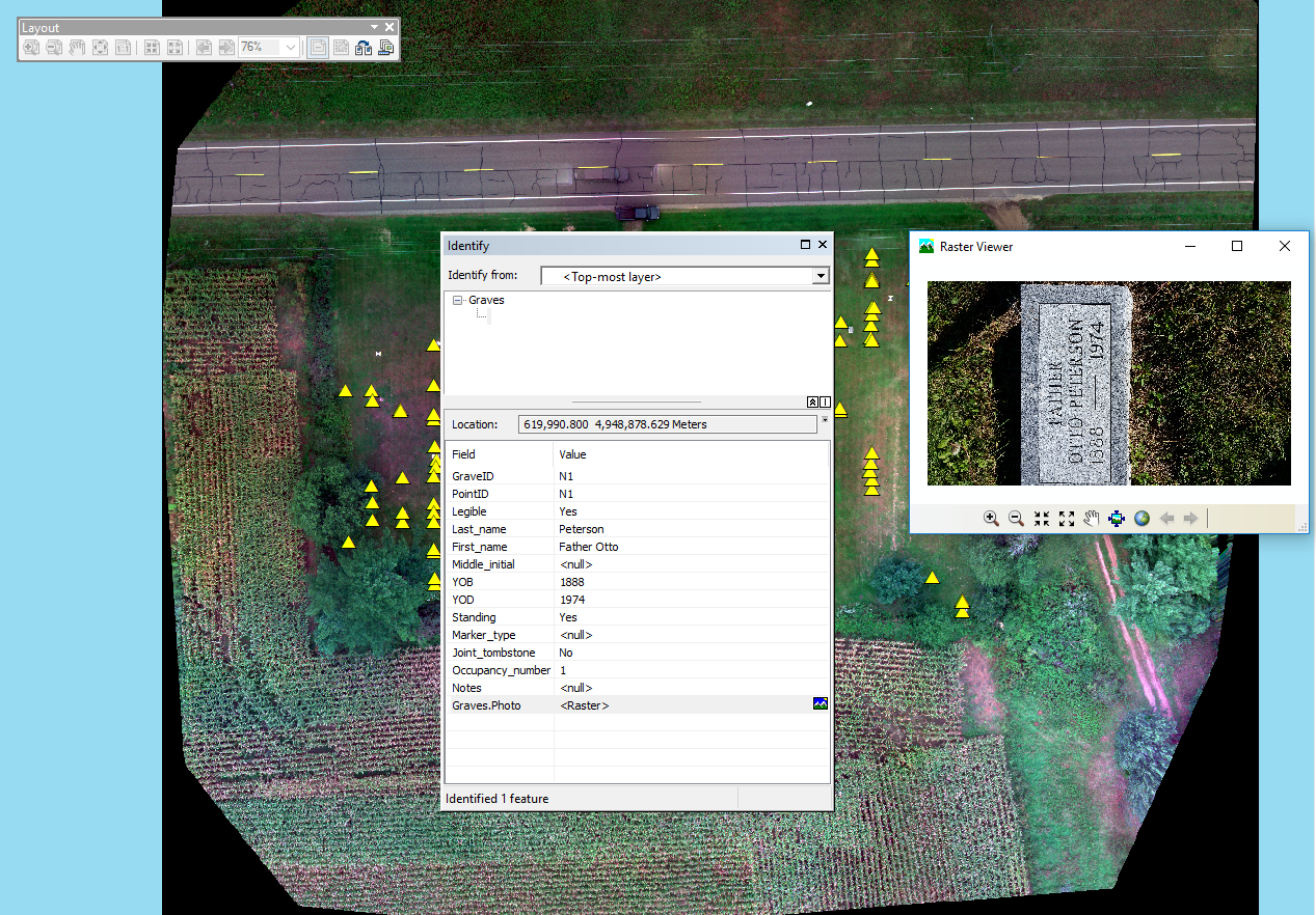
     - In order to construct the GIS, a drone was used to create a high resolution areal photograph of the cemetery. A survey grade GPS was used to map out some of the graves, although, because of time constraints, many of the graves will be manually added in through ArcMap. A camera was used to photograph the graves in order to get a close up view of each grave. A notebook was used to take down all of the data.

What are the overall objectives of the method being employed to gather the data?
     - The overall objectives were to work as a class to record the specific data for each grave site as best as possible. Eventually the data will be compiled into a GIS that will be useable for the Hadlyville cemetery.


Methods

What combination of geospatial tools did the class use in order to conduct the survey? Why?
     - The class used both a survey grade GPS and a drone in order to create accurate data points and to create a base map for our GIS project. 

What is the accuracy of the equipment we used?
     - The survey grade GPS should be accurate within a meter easily. It could potentially be centimeters off but for the most part, it will be very accurate. The drone produces a high resolution image that will allow graves to be easily identifiable from 50 meters. 

How was data recorded?
     - Our data was recorded through pen and paper. As a class we split up and recorded graves in individual rows. Our group made sure that the name and date of death were recorded for every grave. If other important information was provided it too was recorded. Our group also recorded the condition of the headstone itself. Pen and paper approach is generally more reliable for the kind of work that was done in this exercise. The potential for losing data or having data mixed up with digital collection is too high. A phone was used to take the close up pictures of each headstone. 

How will we transfer the data we gather into a GIS?
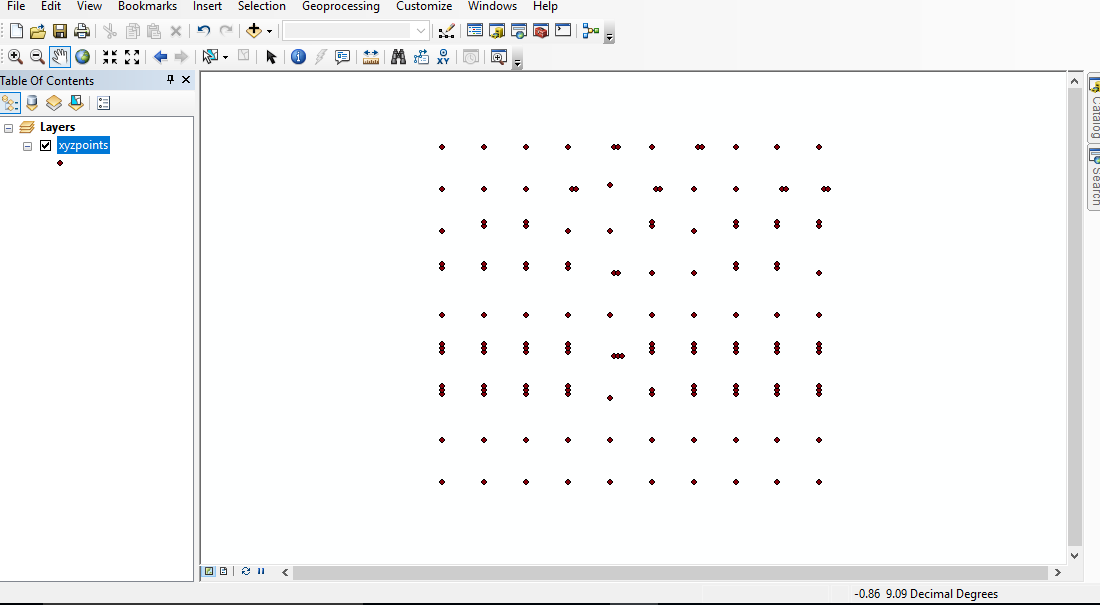
     - The transfer of data into a GIS will be done using ArcMap. The drone imagery will be used as a base map. The GPS points will be added in in the form of a shapefile. The individual data will be added through the attribute table of the points. 

What equipment failures occurred if any?
     - At this point in the project, it is difficult to say if there were any equipment failures. Any equipment failures that may have occurred will be discovered once the data has been transferred to a GIS. 

What might have been done to facilitate data collection in terms of equipment and refining the method?
     - Using a GPS system that works faster but is a little less accurate could have refined the method a little bit. The survey grade GPS system took a very long time and didn't get all of the data. Now manually adding points for graves is necessary. 


Conclusion

How did the methods transfer to the overall objectives of the project?
     -The methods used are a little different from what was originally planned. That being said, the overall objective should still be completed the way that we want. 

How did the mixed formats of data collection relate to the accuracy and expediency of the survey?
     - For the most part, all of the data that was collected had the most important information like the name and the date of death. For the most part, the data on the graves that was readable was collected. 

Describe the overall success of the survey, and speculate on the outcome of the data. 
     - At this point in the project, it seems like the survey was successful. We will have to see how the overall data compilation process goes. 

Sunday, September 11, 2016

Activity One

Introduction

For activity one, the Hadleyville cemetery has lost all of the data and mapping of their cemetery layout. In order to fix this issue, field work needs to be done. The first step is to plan out the steps that will be taken in order to collect the missing data and map out the data. What are the problems and challenges facing the Hadleyville cemetery? All of the data was lost, so this means the project will be started from scratch. There is the possibility that headstones may be damaged or unreadable making it difficult to collect data. Why is the loss of the original maps and records a particular challenge for this project? Without any of the original data, there isn't anything to help guide the project. Some headstones that may be unreadable will be difficult to collect data for. How will GIS help to solve this problem? GIS will allow for the data that is collected to be added to a map in order to tag the data to a location. What makes this a GIS project, and not a simple map? This will be a GIS project because in addition to the map that we create, there will be attributes and data that we collect and attach to the map. What equipment will be used to gather the data needed? The equipment that will be used will be a GPS to tag locations of headstones, and a notebook to record data from each headstone. What are the overall objectives of this project? The overall objective is to obtain the geological location of each  headstone along with important data given on the headstone and connect the data together to form an easily usable GIS map.


Methods

What is the sampling method that will be used? There will be a grid system set up with rows indicated by letters and columns indicated by numbers. This way it will be easy to refer to specific graves sites. The data will be collected one headstone at a time going in order from the corner of the cemetery and snaking to the other side. This way it will ensure that the data will line up with the correct headstone on the map. What will the accuracy of the equipment that will be used be? The GPS should be survey grade. This means the points that we collect should be very accurate. This is necessary because the cemetery itself is rather small. How was the data entered? The data will be entered in a notebook first by both teammates to ensure accuracy. As stated before, a grid system will be used in order to keep everything organized. How will the data that is collected be entered into GIS? The data will be entered through ArcGIS. The GPS unit will be able to transfer point data that is collected and then the descriptive data that is taken from the cemetery will be entered manually. What drawbacks are there to this method? The main issue that could come up when collecting data, is the potential for headstones to be unreadable or out of place. This is something that will be hard to fix because the original data has been lost. Critical thinking is going to be the main way that these issues will be resolved. 


Conclusion

How do our methods transfer to the overall objectives of this proposal? I think that our methods will allow us to accomplish the goals that we need to. We will be able to create a working, organized GIS system to link the data from each gravesite to its geographical location.